Redesigning CNA’s Smart TV Experience
A lean redesign focused on making it easier to discover, watch, and return to the content that matters — without digging through menus.

The original app had cluttered layouts, confusing navigation, and low engagement. Users struggled to find what they wanted or where to begin.
I explored ways to simplify the layout, reduce decision fatigue, and make the experience feel more relaxed, like TV should.
Client
Channel News Asia
Timeline
10 months
Role
UX Research · Interaction Design · Prototype
Platform
Smart TV
What was holding users back
Even though CNA delivered quality content, users hit roadblocks navigating the app — especially on Smart TVs. From clunky remote interactions to inconsistent visuals across platforms, the experience needed rethinking.
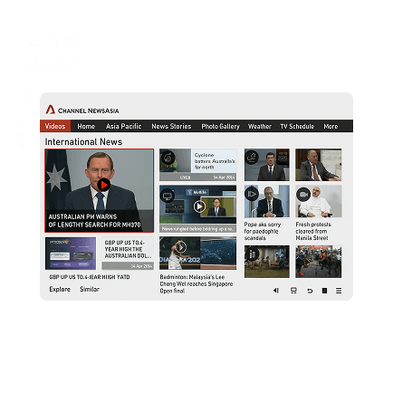
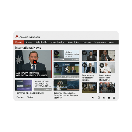
Old user interface
Too many entry points led to decision fatigue
Homepage lacked clear structure or guidance
Episode access was buried behind generic categories
No visual or UX cues for “where do I begin?”
Where the experience was breaking
Even though Channel News Asia delivered quality content, users often hit roadblocks while navigating the app — especially on Smart TVs. From clunky remote interactions to inconsistent visuals across platforms, the experience needed rethinking.
Smart TV is primary for OTT
Remote UX was the real friction
Viewers drop off early
Low store ratings echoed the problem
Competitor insights
I studied a range of Smart TV platforms — news apps like Fox News, Haystack, and CNBC, and streamers like Prime Video, YouTube, and Apple TV. Looking at how each handled discovery, layout, and remote interaction shaped key decisions in the redesign.

Surfacing live or trending content upfront reduces clicks and decision fatigue.
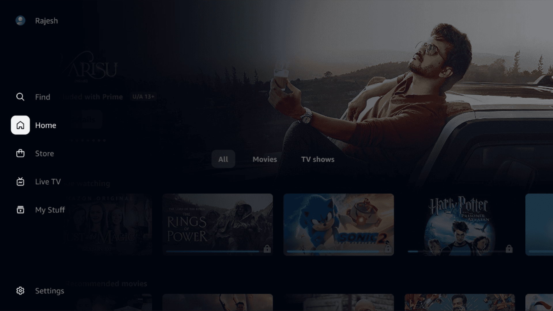
Side navs that stay visible or collapse smartly let users explore without breaking flow.

QR logins and simple entry points speed up access across TV platforms.

D-pad-friendly layouts with clear focus states support lean-back interaction.
Shaping the new flow
I reworked the information architecture around the way people navigate with a TV remote. Rather than treating every screen independently, I focused on reducing unnecessary decisions, improving focus movement, and creating consistent patterns across browsing, search, and scheduling.

Design System
Redesigning the Core Flows
From home to search to schedules, we restructured key screens to feel fluid, remote-first, and consistent across platforms. Each screen now guides the user — not just visually, but through focus and behavior logic that feels native to TV.
Home Screen

We prioritized live content, added auto-play logic, and surfaced personalized carousels to reduce choice fatigue.
Navigation flow, focus defaults, and fallback states were refined for seamless remote-first movement.
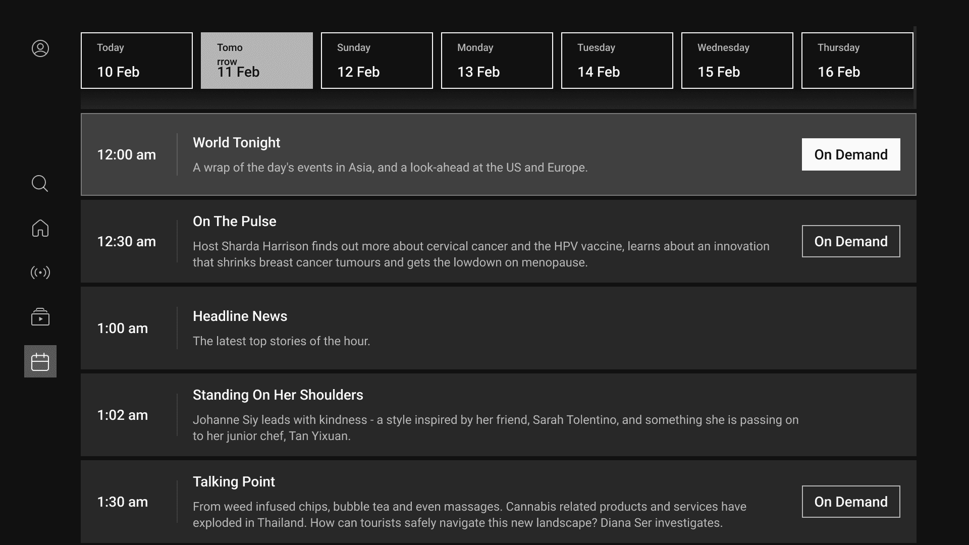
We fine-tuned focus jumps, tab transitions, and kept playback running in the background.

VOD content is grouped by genre priority, with focus-driven previews and instant playback.
Search

