WayCool Dashboard — Turning Raw Data Into Actionable Insights
Designing WayCool's internal financial operations dashboard — replacing inter-departmental loan tracking, credit approvals, and budget management that lived across disconnected Excel sheets.
WayCool is one of India's largest agri-commerce companies, supplying 2,000+ tonnes of food daily across 169,000+ retailers in 6 states. At that scale, internal financial coordination had become a serious bottleneck.
I spent 3 days on-site with the finance and operations teams observing how they actually worked before a single screen was designed.
Timeline
6 weeks
Role
UX Design · IA Structuring · UI Design
Platform
Web (Internal Dashboard)
Industry
Agri Supply Chain · Operations
Turning Frustrations Into Features
Three days on-site with WayCool's ops and finance teams revealed how deeply fragmented their internal workflows had become. Every pain point traced back to the same root cause: there was no single system of record.
Different Excel sheets managed vendors, inventory, and payments — making coordination tedious and error-prone.
Teams relied on calls and messages to track orders or update payment status — nothing was centralized.
No quick view of what’s delayed, pending, or complete — decisions were based on outdated information.
Any change meant modifying multiple sheets. No structured flows, no access control, no consistency.
The Design Challenge
This wasn't just a UI problem; it was an information architecture problem. The core question wasn't "How do we make Excel look better?" but "What does a single source of truth for interdepartmental finance need to contain, and how do different roles interact with it differently?" A field manager tracking a loan repayment needs a completely different view than a finance lead reviewing credit approvals.
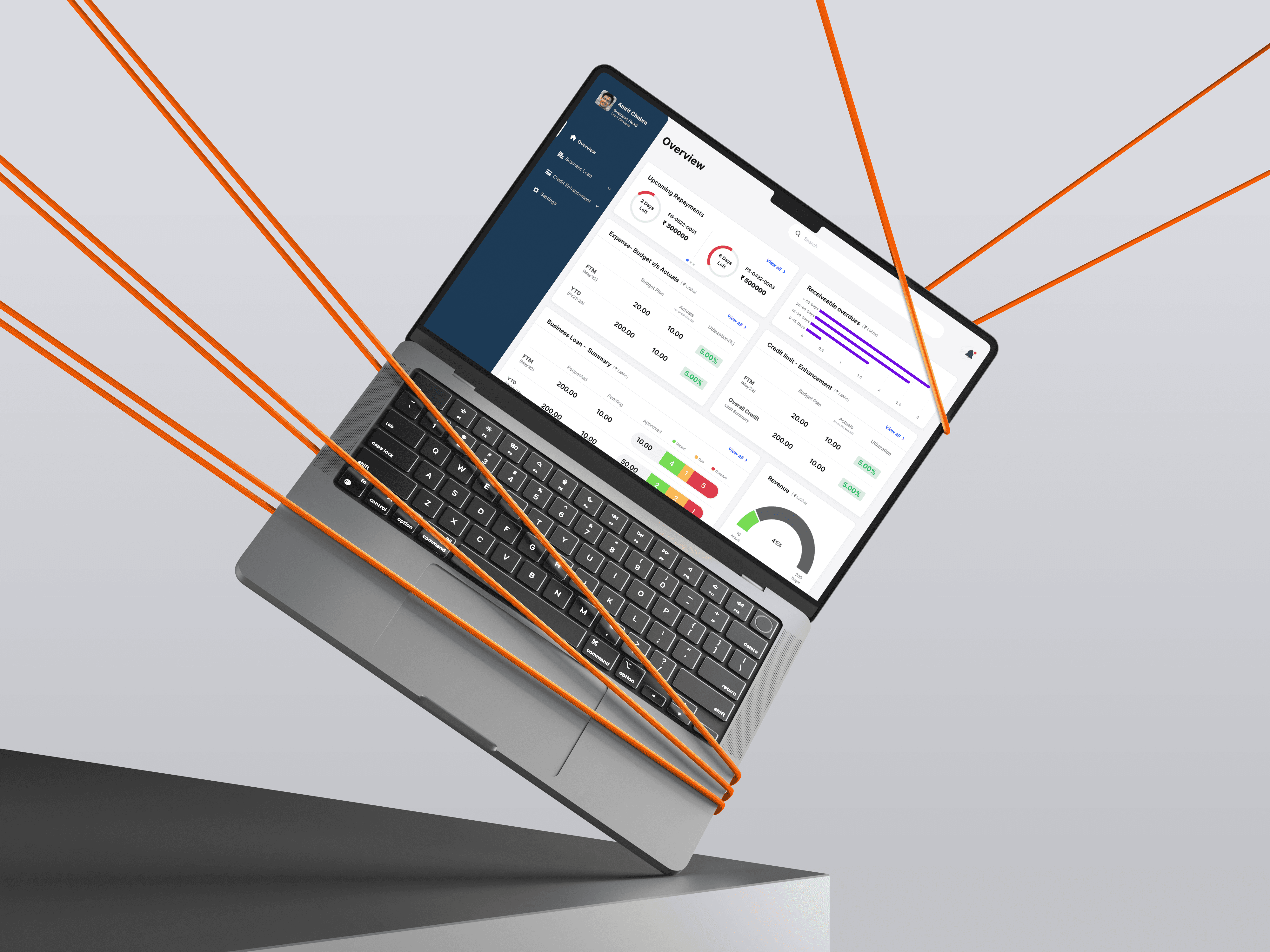
What We built
The dashboard centralised four workflows that were previously scattered:
Business Loan Tracking
Credit Limit Enhancement
Budget vs Actuals
Overview Dashboard


