Designing a Smarter Race Day for
the AMG Driving Academy
A concept project to rethink how amateur drivers track performance, prep for race day, and reflect after.

AMG Driving Academy is a high-performance driving experience hosted by Mercedes-Benz. I was tasked with designing a multi-user event platform that simplifies the journey for three key audiences — participants, spectators, and organizers.
The focus was on smooth onboarding, real-time visibility, and improved engagement during live events.
Timeline
1 week (Assignment)
Role
UX, UI, Systems Thinking
Platform
Mobile + Dashboard
Industry
Automotive / Motorsport
Understanding Diverse Needs
Each role — participant, organizer, spectator — had a distinct set of goals and blockers. I mapped needs across the race day lifecycle to uncover shared tensions and gaps.


Digging into the gaps
To ground the experience in real needs, I began with a competitive audit of race event platforms — from motorsport academies to festival apps. This helped uncover key gaps in onboarding, content delivery, and real-time coordination across roles.

Who I Was Designing For
Casual Racers wanted clarity, not data overload.
Organizers needed fewer tools, fewer tabs.
Spectators just wanted real-time updates, fast.

Mapping the Spectator Experience
I focused deeply on the spectator journey — from hearing about the event to being on-site and reliving it afterward. This helped uncover overlooked moments like delayed information, downtime during the race, and poor navigation areas.

From Gaps to Ideas
I began by identifying what was breaking down for each group — onboarding friction for participants, passive viewing for spectators, and lack of post-race insights for organizers.
These quick “How Might We” questions helped shape the design direction:
Make race day feel easier to navigate
Keep everyone informed without slowing them down
Support meaningful takeaways after the event

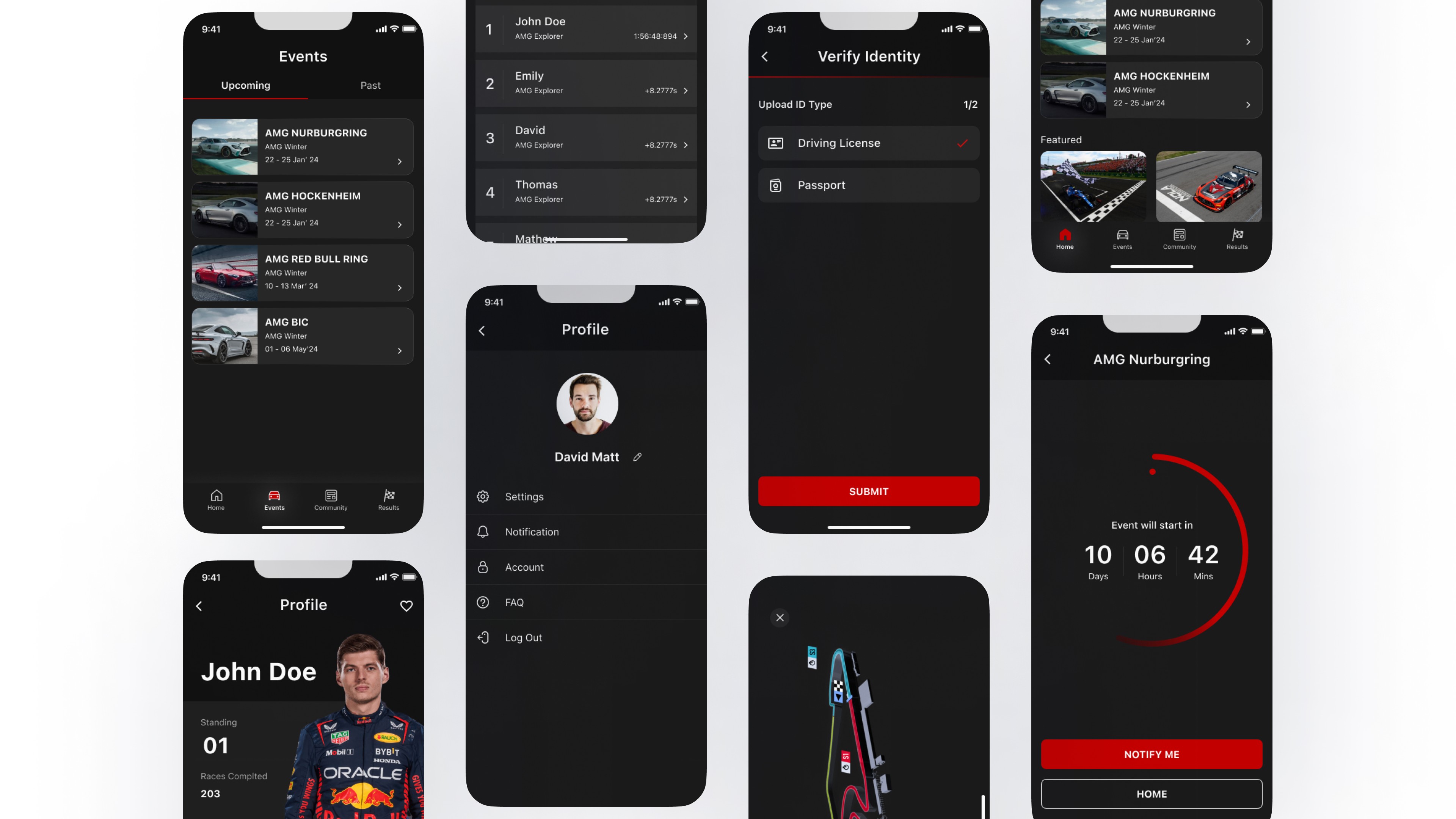
The Three-Part Solution
These three interfaces — mobile, dashboard, and web — worked together to support every side of the race day experience.
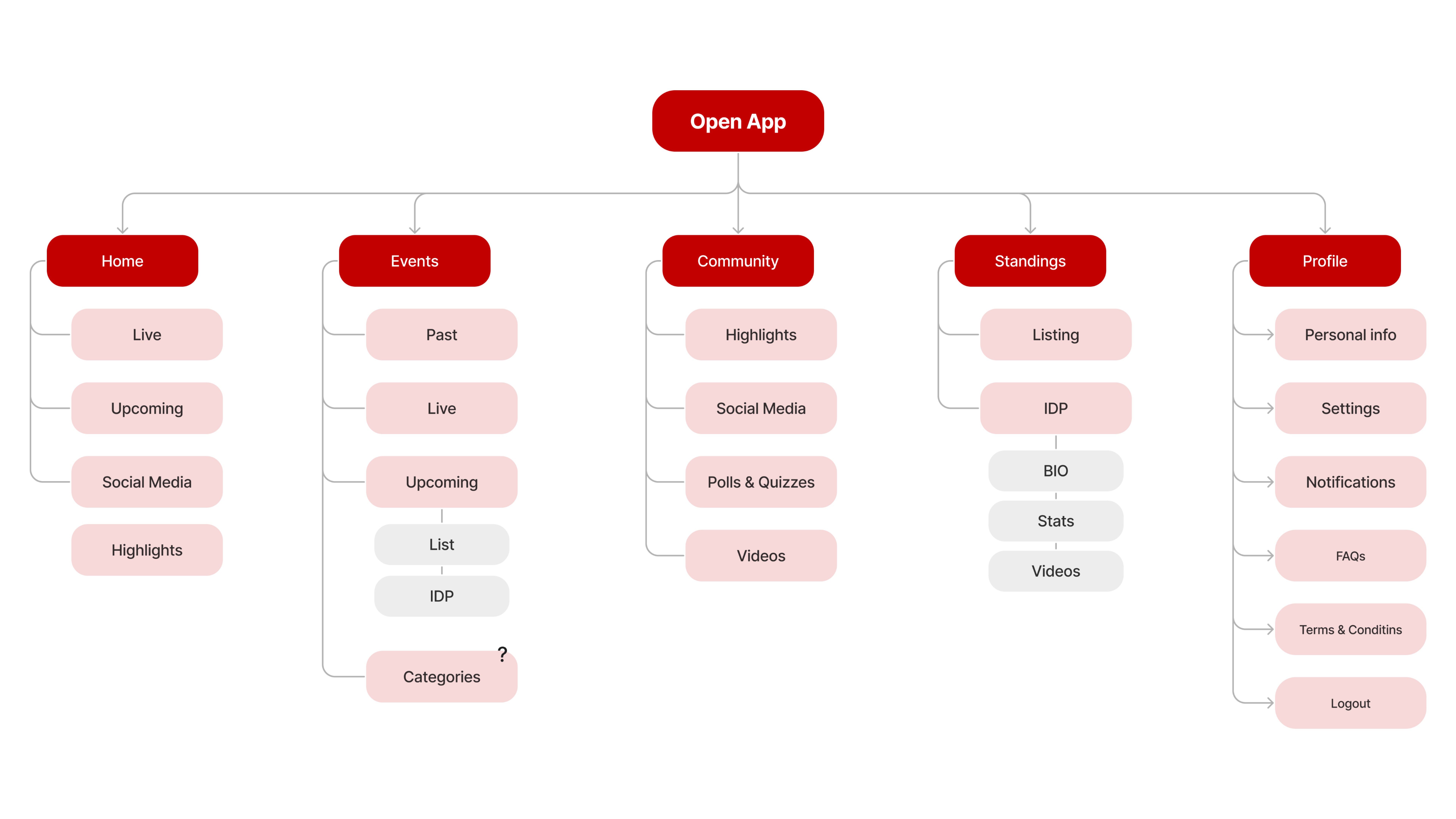
Participant Flow & Content Structure
This mapped the full experience — from registration and prep to live access and follow-ups. It shaped how users navigate, act, and stay engaged across event phases.

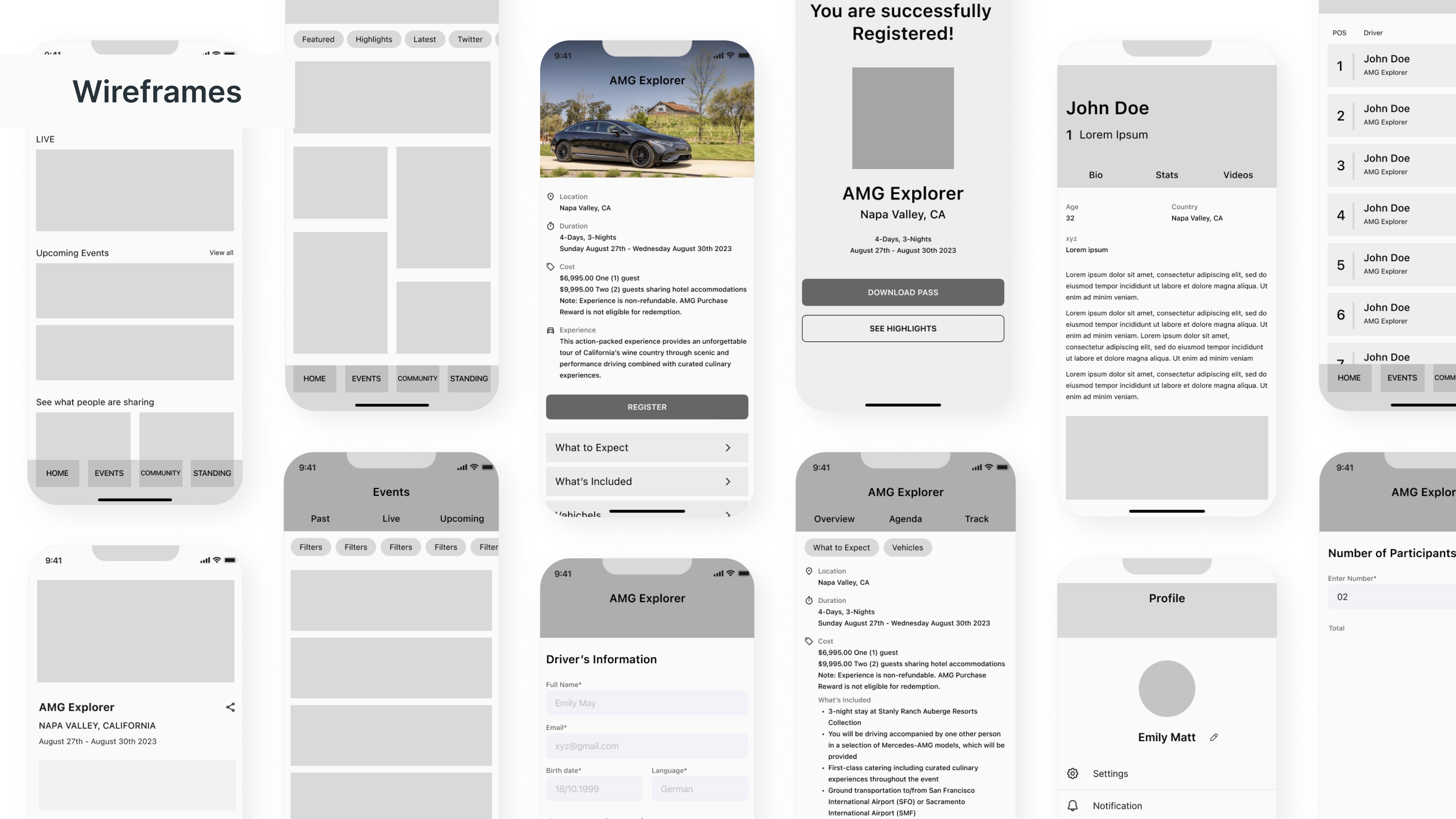
From Sketch to System
The design process moved from rough paper sketches to structured wireframes — helping validate layout, flow, and information hierarchy early. These low-fidelity drafts kept the focus on utility before visual polish.

Rebuilding the Key Flows
From home to search to schedules, we restructured key screens to feel fluid, remote-first, and consistent across platforms. Each screen now guides the user — not just visually, but through focus and behavior logic that feels native to TV.

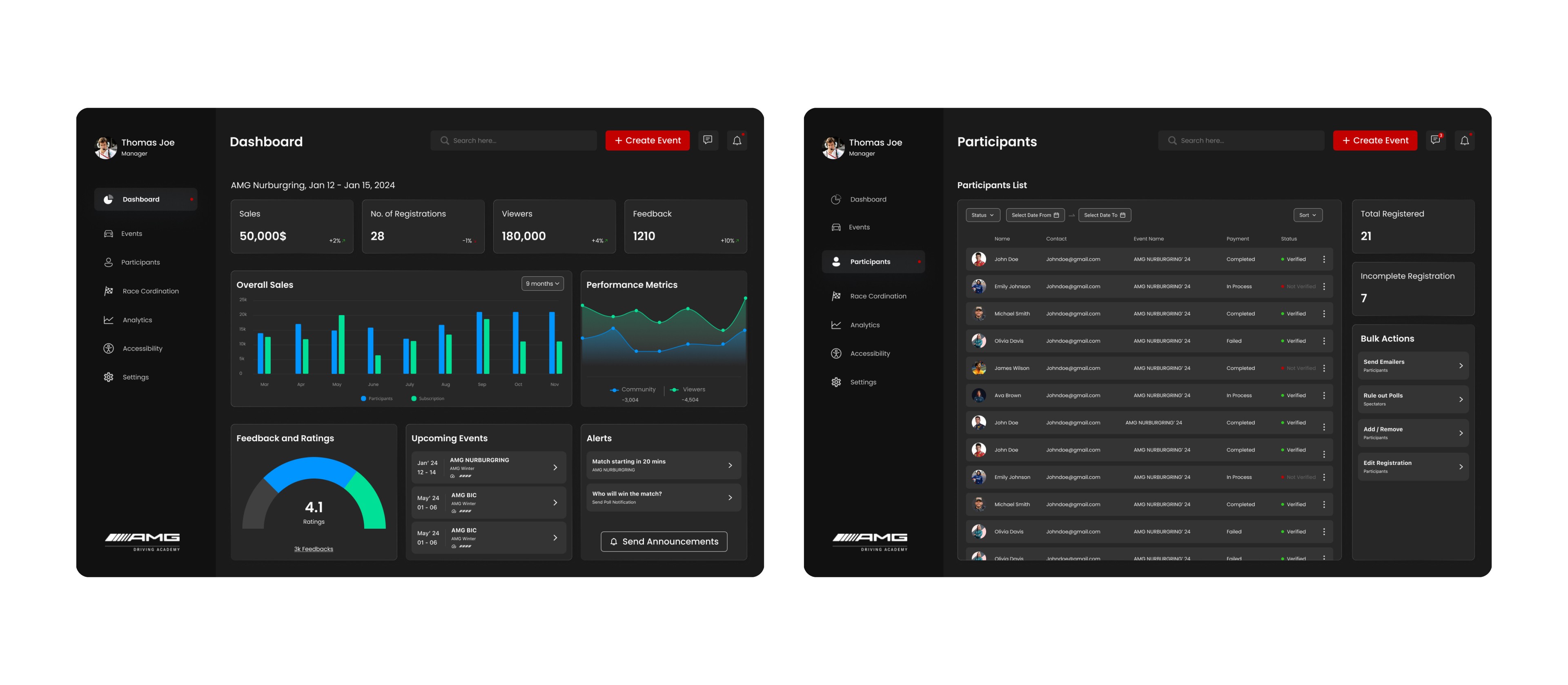
The "Overall Dashboard" is a central control panel for event organizers, providing a comprehensive view of event-related data, participant management, financial insights, and performance metrics. This screen empowers organizers with the tools they need for successful event planning and management.